Categories
How it works
Find a designer
Inspiration
Studio
03 9111 5799
Log in
Log in
Home
Button or icon
Button or icon contests
iPhone App Icon Refresh - Make it awesome!
iPhone App Icon Refresh - Make it awesome!
by
tapforms
78% (32) of active designers received comments
97% rated or declined designs
2 contests (0 refunds)
Fast-tracked
Following the open round, the client will select a winning design. There is no refinement stage.
Guaranteed
The client has guaranteed to award the prize.
Watchers
(6)
6 people are watching for updates.
Brief
Designs
(169)
Designs
(169)
Brief
Designs
(169)
Share on Facebook
Share on Twitter
Share on Pinterest
This contest has finished. Congratulations to the winning designer
webad
!
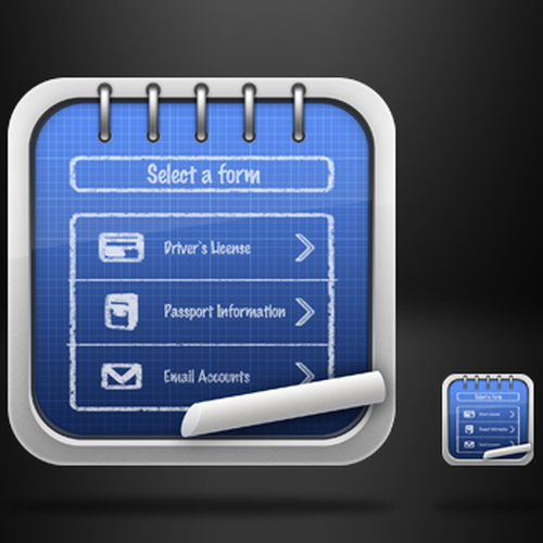
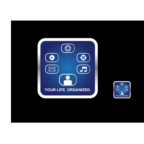
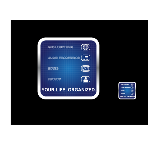
Winning entry
#124
by
webad
Deleted by 99designs
Withdrawn by designer
Declined
Winner
Entries
All
(10)
All (10)
Unrated (3)
1–2 stars (4)
3–5 stars (3)
Declined and withdrawn (159)
All
(10)
Unrated
(3)
1–2 stars
(4)
3–5 stars
(3)
(159)
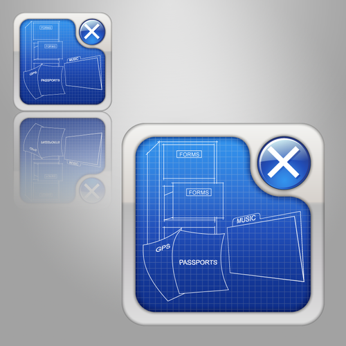
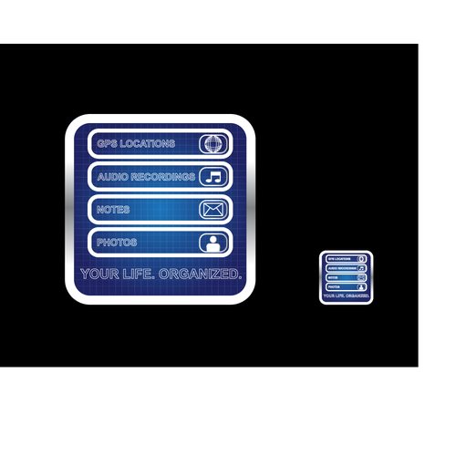
#124
by
webad
Deleted by 99designs
Withdrawn by designer
Declined
Winner
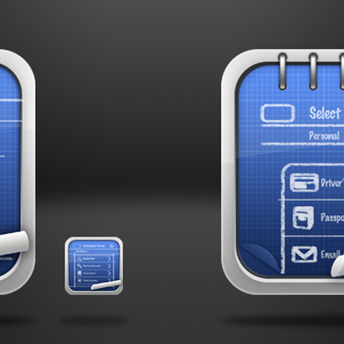
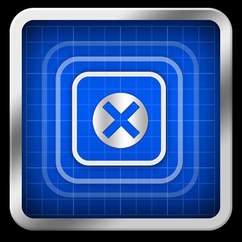
#118
by
webad
Deleted by 99designs
Withdrawn by designer
Declined
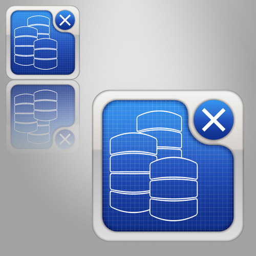
#127
by
Hightown Hill
Deleted by 99designs
Withdrawn by designer
Declined
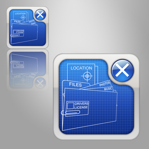
#166
by
Hightown Hill
Deleted by 99designs
Withdrawn by designer
Declined
#165
by
Hightown Hill
Deleted by 99designs
Withdrawn by designer
Declined
#143
by
Underrated Genius
Deleted by 99designs
Withdrawn by designer
Declined
#164
by
Underrated Genius
Deleted by 99designs
Withdrawn by designer
Declined
#169
by
applework
Deleted by 99designs
Withdrawn by designer
Declined
#168
by
applework
Deleted by 99designs
Withdrawn by designer
Declined
#167
by
applework
Deleted by 99designs
Withdrawn by designer
Declined
Home
Browse categories
How it works
Find a designer
Inspiration
99designs Pro
Design services
Design contests
1-to-1 Projects
Find a designer
Discover inspiration
99designs Studio
99designs Pro
Get a design
Logo design
Business card
Web page design
Brand guide
Browse all categories
Support
03 9111 5799
Help Center
Resources
Pricing
Become a designer
Blog