As they say, “everything old is new again,” and 2018 will be a year of modernizing graphic design trends from the past and diverging from the (literally) flat design landscape of recent years. Minimalism and simplification will stick around, but expect to see some old favorites make their return to the limelight with modern, updated looks.
>> Check out the newest graphic design trends here
If you’re feeling fashionable and want to add some contemporary flair to your designs, check out the trends that will wow your customers.
Here are 10 graphic design trends to watch in 2018
—
- Responsive logos
- Gradients
- More depth (with semi-flat design)
- Dashing duotones
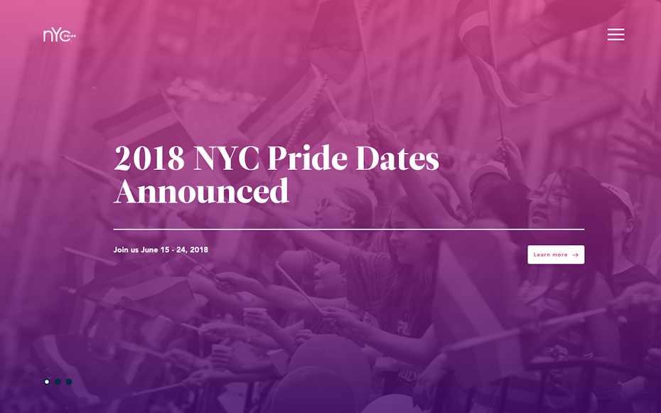
- Palettes & patterns inspired by the 80’s & 90’s
- Movement: animations & GIFs
- Bold typography
- Custom graphic art and illustration
- Authentic photography
- Highly-detailed vintage
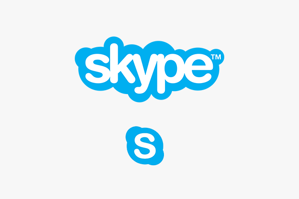
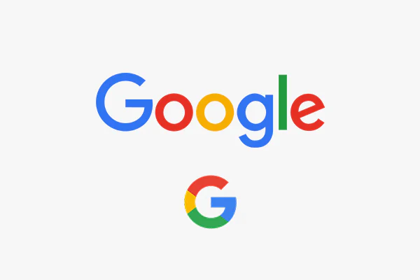
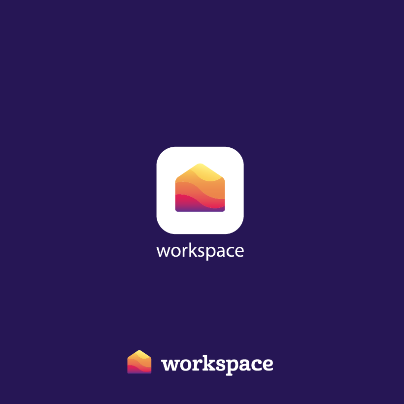
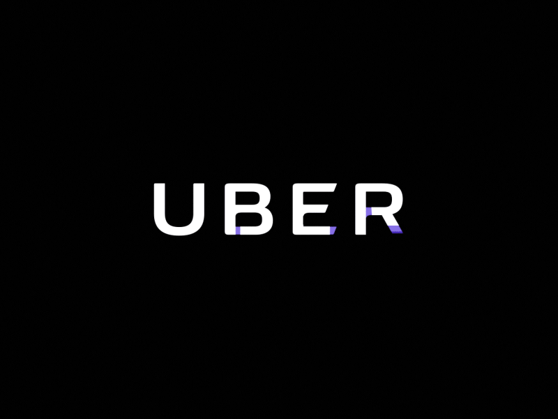
1. Responsive logos
It’s been 10 years since responsive design began to revolutionize the web, and since then it has become the industry standard. The rapid rise of mobile browsing (and an endless assortment of devices and screen sizes) has created critical usability issues for traditional websites. Designers and developers began experimenting with various ways to make designs adapt to the user’s device as a one-website-fits-all solution. This laid the groundwork for what would become known as “responsive design.”
The idea of altering logos to meet the same user demands has largely remained unthinkable… until now. Companies have been refreshing their logos into modern, simplified versions over the past few years and responsive logo design is the logical next step in meeting the demands of today.
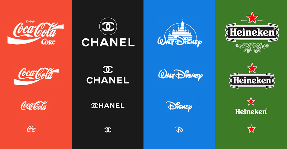
Digital and interaction designer Joe Harrison created an experimental project called “Responsive Logos” to explore the creation of scalable logos for some of the world’s biggest brands.
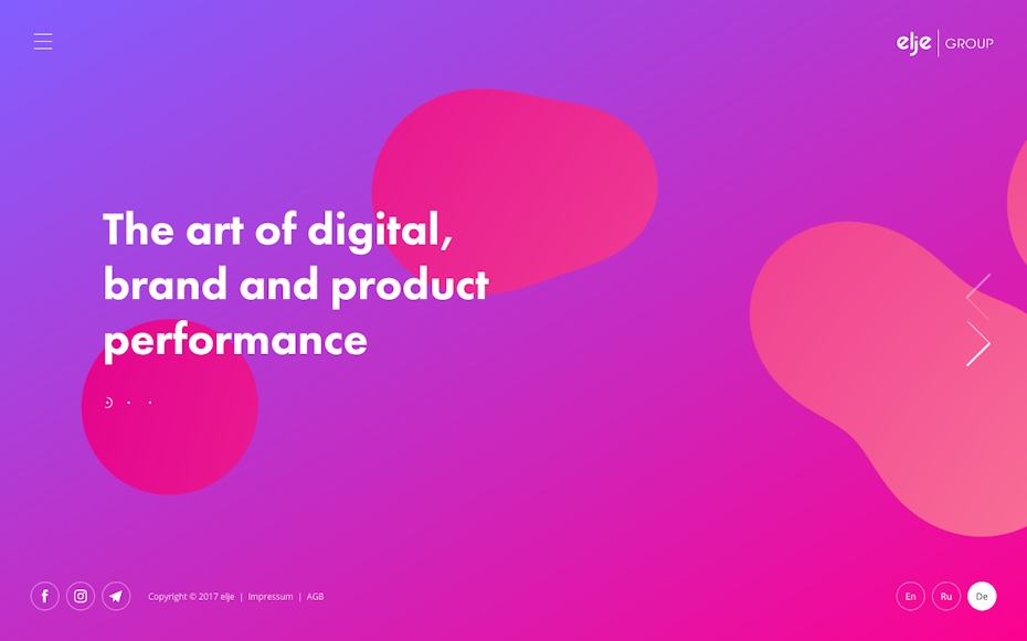
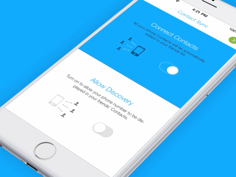
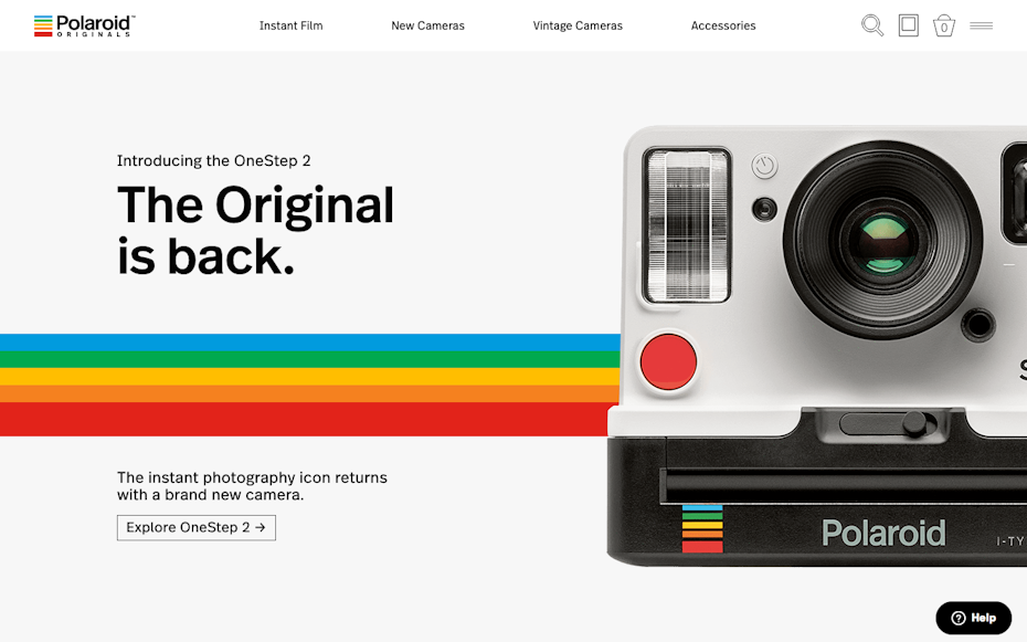
2. Gradients (and we’re also calling them color transitions)
In the not-so-distant past gradients reigned supreme. They were found on every website button, page header and PowerPoint presentation. Your corporate PDF wasn’t cool unless a gradient graced the cover. Then, sometime around late 2007 they were sidelined as we embraced an era of flat design.
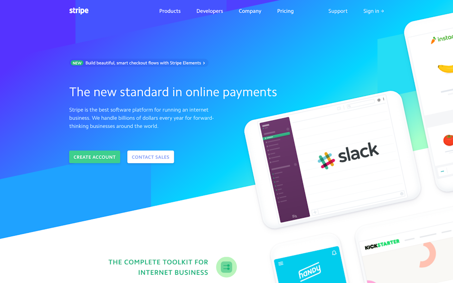
Flat design is evolving, and gradients are making their modern-day comeback as a flat design enhancement. This enhancement is part of a design update often referred to as “flat 2.0” or “semi-flat design”. Their reappearance in iOS and adoption by industry leaders like Stripe and Instagram have solidified their popularity once again, and you’ll be seeing them in the form of vibrant UI, branding, backgrounds, illustrations and overlays.
We’re also seeing an increased use of the term “color transitions” when referring to gradients. While the terms seem to be used interchangeably, “color transition” more often refers to the modern application which is vibrant, smooth and “flatter”—fitting within flat design aesthetics.
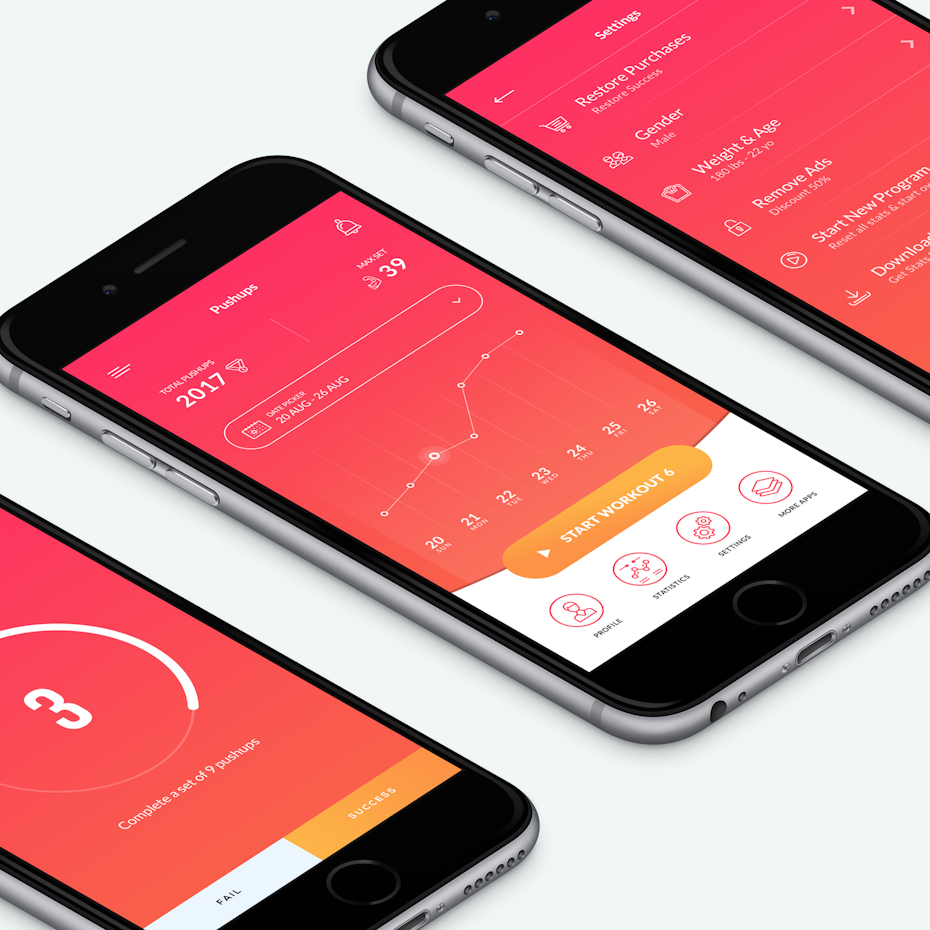
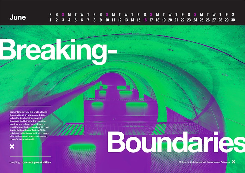
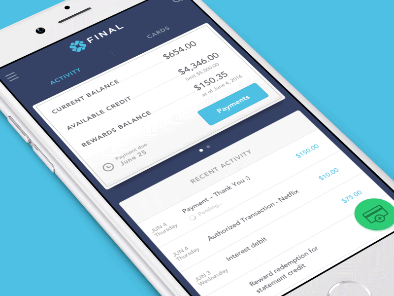
3. More depth (with semi-flat design)
We’ve been seeing them a lot lately, and it’s safe to say that shadows are officially back in 2018. Like gradients, shadows were put on the back burner as we stripped realism and skeuomorphism from our designs in favor of extreme minimalism and two-dimensional design.
In hindsight, depth was a valuable tool for helping users determine visual hierarchy, input fields and calls to action on screen. Designers had been experimenting with “long-shadows” as an acceptable means to add more dimension to their flat designs when Google Material Design reintroduced real shadows as an enhancement to their UI. The idea quickly spread outside of Material Design and designers began reintroducing shadows of their own. These shadows were large, soft, sometimes colored and added subtle depth and dimension unlike their harsh, overused, “drop-shadow” predecessors.
The purists may not like it, but depth has proven that it can fit within the evolving ethos of flat design by improving usability and simplicity, both of which are core principles of flat design. Going forward you will see shadows become a staple of the “semi-flat” design movement. We’re already seeing them being used to enhance icons and illustrations, as well as websites, app interfaces and even print designs.
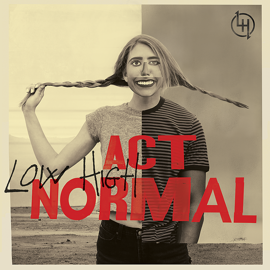
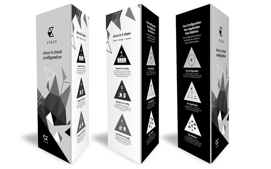
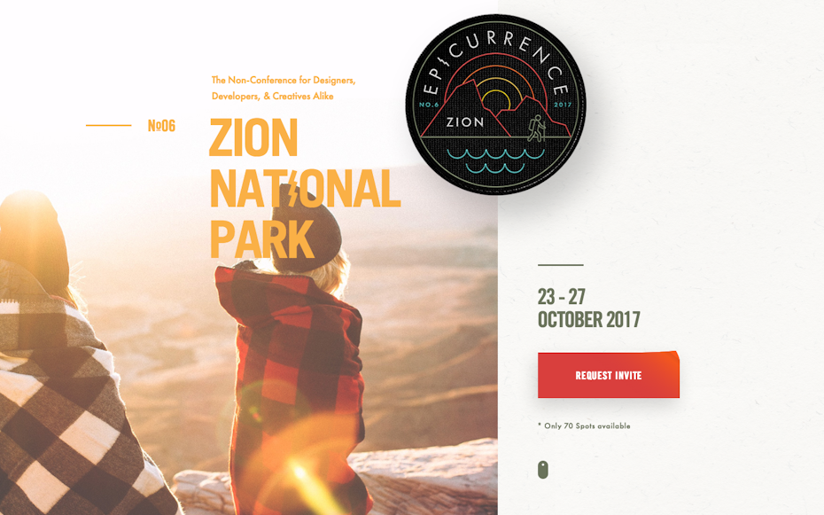
4. Dashing duotones
Duotones are traditionally created through a halftone printing process where one halftone is printed on top of another of a contrasting color, creating a two-toned image. This fundamental printing technique has found new life in digital media. Imaging software has made it easier than ever to create duotones, as well as related variations like monotones, tritones, quadtones and “fake duotones” (tinted images).
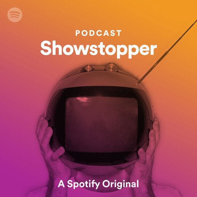
Spotify has been credited with their return to mainstream design by using duotone images in their app and promotional microsites. Designers are taking advantage of this technique as imagery created within a limited color palette is delightfully complimentary to semi-flat design.
With bold colors and beautiful application possibilities, duotones are predicted to be one of the hottest trends of 2018.
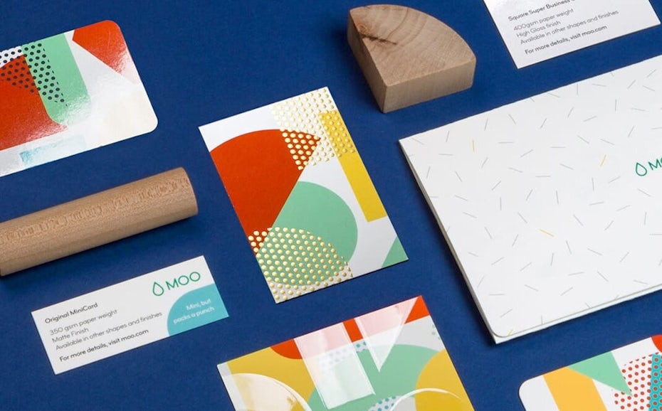
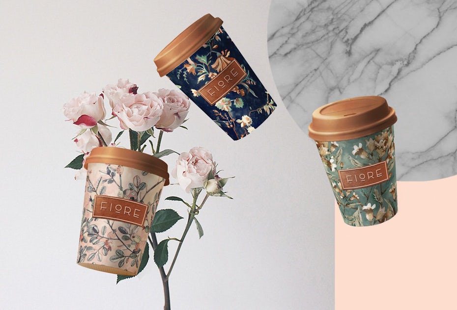
5. Palettes & patterns inspired by the 80’s & 90’s
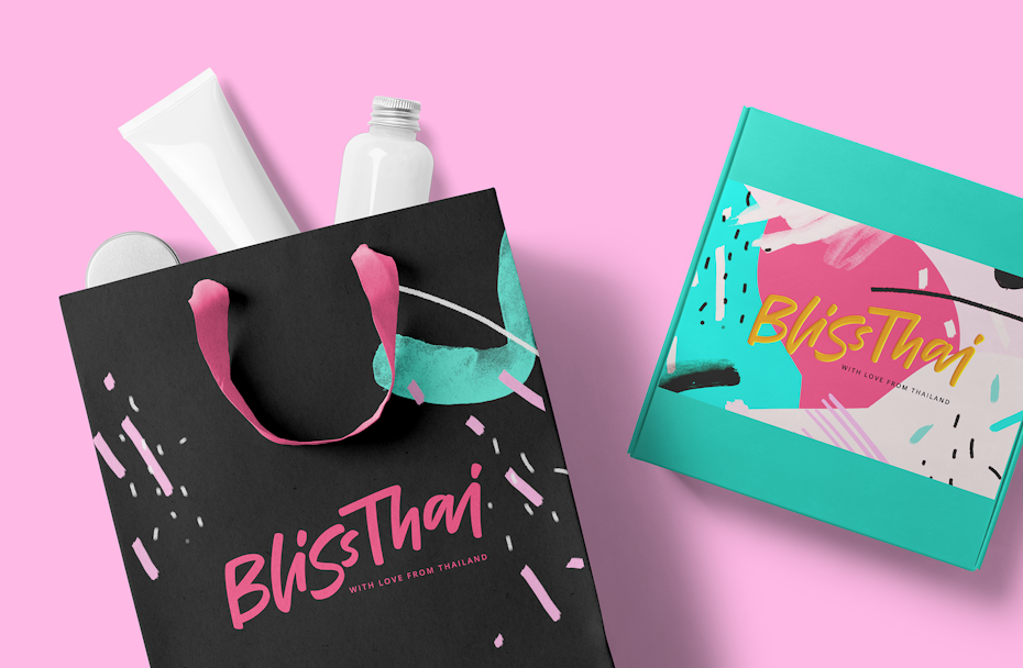
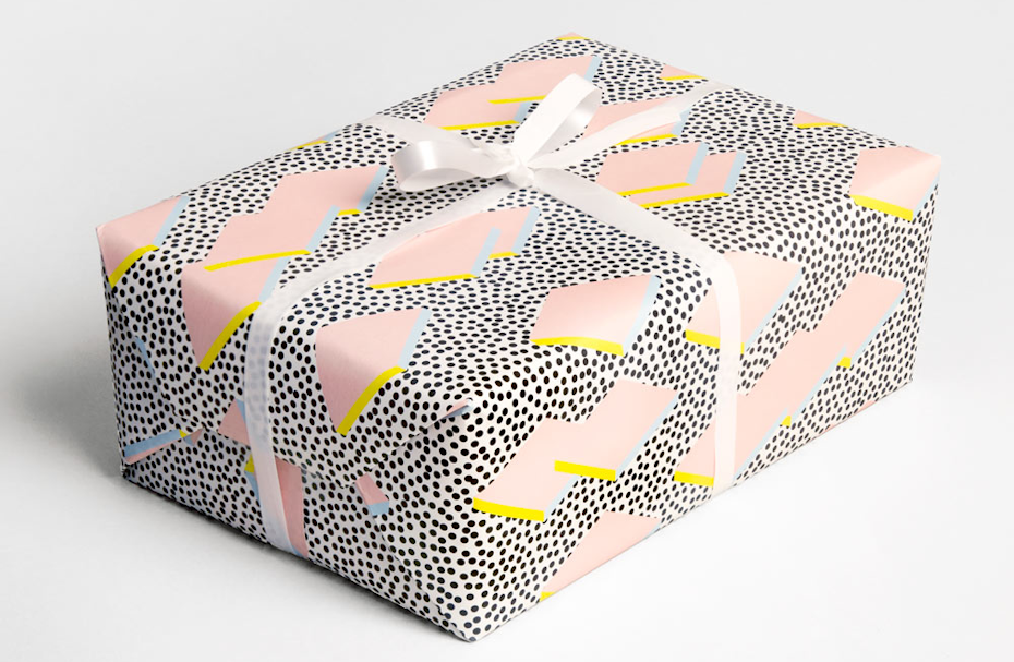
From pretty pastels (“millennial pink”, anyone?) to electric hues, color schemes from the 80’s and 90’s have been gaining popularity once again. With the movement away from ultra-flat designs, expect to see the abstract and geometric patterns inspired by the era move from the fringes into the mainstream as well.
As children of the 80’s and 90’s become more prominent and influential as both brand leaders and key target audiences, this trend can add visual excitement as well as a touch of nostalgia to your designs.
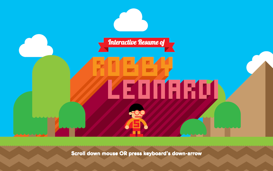
6. Movement: animations & GIFs
You may be hearing a lot of buzz about microinteractions lately, but what exactly are they and why should you use them? Simply put, microinteractions are tiny animations used to communicate with users and help them perform tasks. They are a UX best practice, and possibly one of the biggest UX trends to date.
Microinteractions are everywhere and though you may not be consciously aware of them, every time you receive a notification on 99designs, like a post on Facebook or swipe left on Tinder, you are engaging with microinteractions. They are particularly useful in making users feel like they are manipulating an interface by providing feedback for their actions. Paying attention to the details can really take your designs to the next level.
When it comes to larger animations, GIFs and SVGs are valuable tools for communicating ideas, concepts and processes while making content more engaging for users. GIFs have come a long way since their animated clip art days and have evolved to fit in fabulously with the modern web. Add interest to ads, email newsletters, illustrations, icons and logos by taking advantage of this trend. Animated GIF logos have really become a trend of their own and it’s easy to see why—they’re slick, clever and extremely appealing.
Speaking of appealing animation, the cinemagraph is making a come back! These animated images are essentially still photos with a repeating video loop for only a selection of the image. Think beautiful landscape with a single animated tree blowing in the wind. That contrast of movement on extreme stillness looks striking and surreal. Cinemagraphs are either videos or animated GIFs, and you can expect to see them coming to websites, apps and social media ad campaigns near you in 2018.
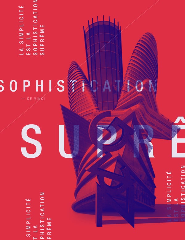
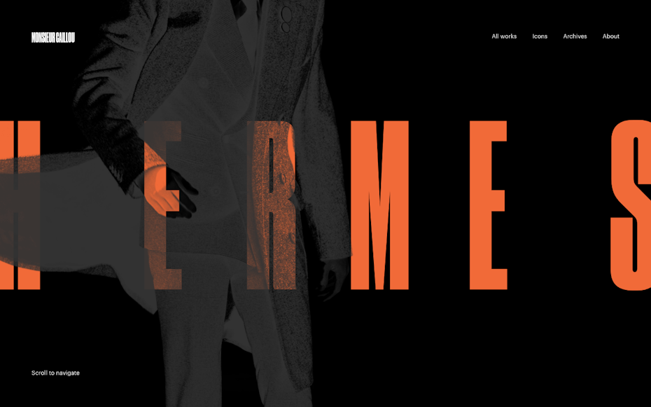
7. Bold typography (and serifs return to the screen!)
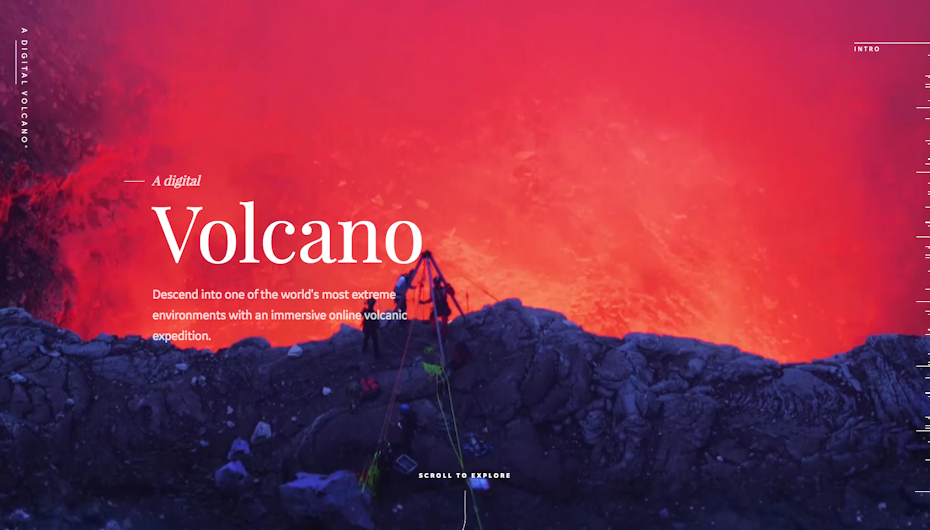
When it comes to typography in 2018 you’ll find that the bigger and bolder, the better. Designers will be opting for artistic effects, extra-large font sizes and huge headlines. Helvetica-inspired sans serifs have dominated digital spaces, and while they’ll remain as fashionable as ever (especially their extra-bold family members), we can expect more typeface variety in the coming year.
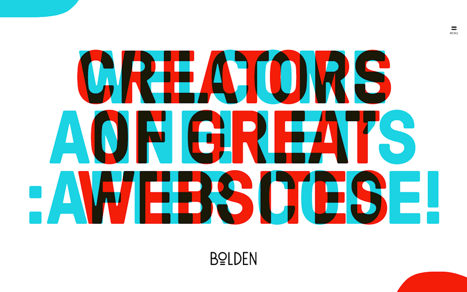
This variety will include more decorative and hand-made fonts as well as—gasp!—serif fonts. Our serif font friends have been making a rapid reappearance on screens, especially when paired with sans serifs. With a demand for synchronization across all media, designers shied away from serifs almost entirely to avoid inconsistency as brands began to live more of their lives online. With the serif’s increasing acceptability on screens (likely due to better screens and Google Web Fonts’ impressive options), we can expect a ripple effect and for the serif to regain some of its former footing.
Trends mainly seen in print will also be finding their way on screen. These will include experimental and artistic typography, more creative layouts and placements involving imagery, and bolder variations in alignment and kerning.
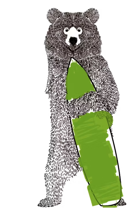
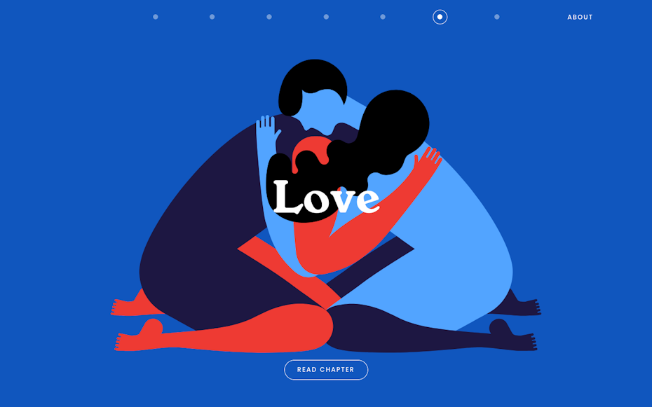
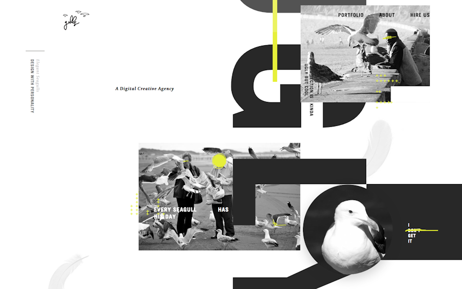
8. Custom graphic art and illustration
Whether they are whimsical, practical, or purely artistic, the demand for custom graphic art and illustrations will continue to grow in the new year. Custom imagery has always played a major role in print media. When it comes to digital media however (despite being a star player of Flash websites in the 2000’s), custom graphic art and illustration has taken a backseat to cheaper stock imagery alternatives for much of the last decade.
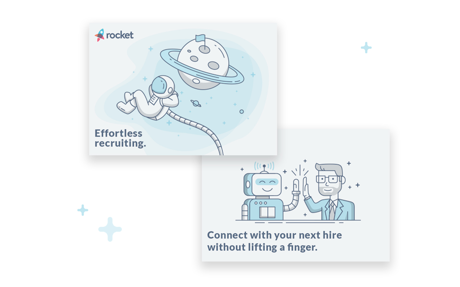
The accessibility of stock left drawing, painting, calligraphy, artistic typography, photography and illustration underutilized on the modern web. This includes modern renditions of classic graphic design techniques like duotones and double-exposures for example, both of which are becoming trends of their own. The movement toward flat design also left little room for these embellishments and as we opted for icons and illustrations tailored to flat design trends, we left things looking a little homogenized.
Custom artwork and illustration helps create a visual language which can really enhance and add personality to a brand. In 2018, you can feel free to get really creative as we’ll see more artwork in a broader range of styles surface as designers and their clients begin to untap the potential of these underused assets.
9. Authentic photography
Authentic photography looks and feels real. Whether you’re working with custom photos or selecting stock, look for images that convey emotion, contain action or tell stories. Unfiltered and unstaged photography was a huge part of advertising in the 90’s, and though we’re not quite sure why models spent the next 15+ years shaking hands and smiling at their screens, it’s refreshing to see natural (and more interesting) compositions return to the mainstream once again.
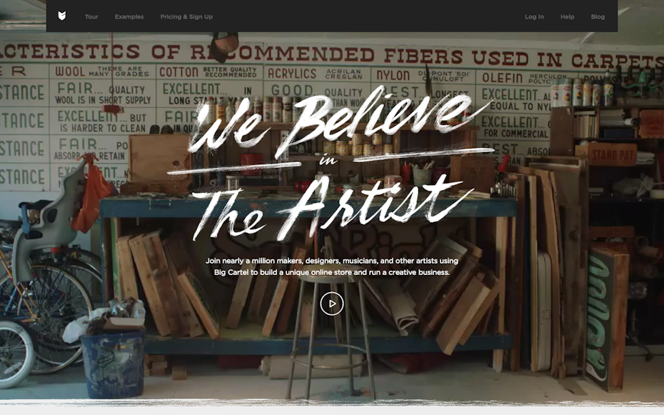
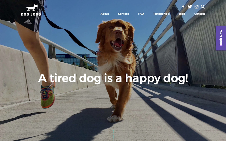
Demand for real-life photography grew significantly in 2017 and will grow even more in 2018 as brands seek to connect with their users, and designers seek to rid the world of cheesy stock photography. Luckily there are lots of amazing photographers out there who are helping meet this demand through premium and free stock photography resources.
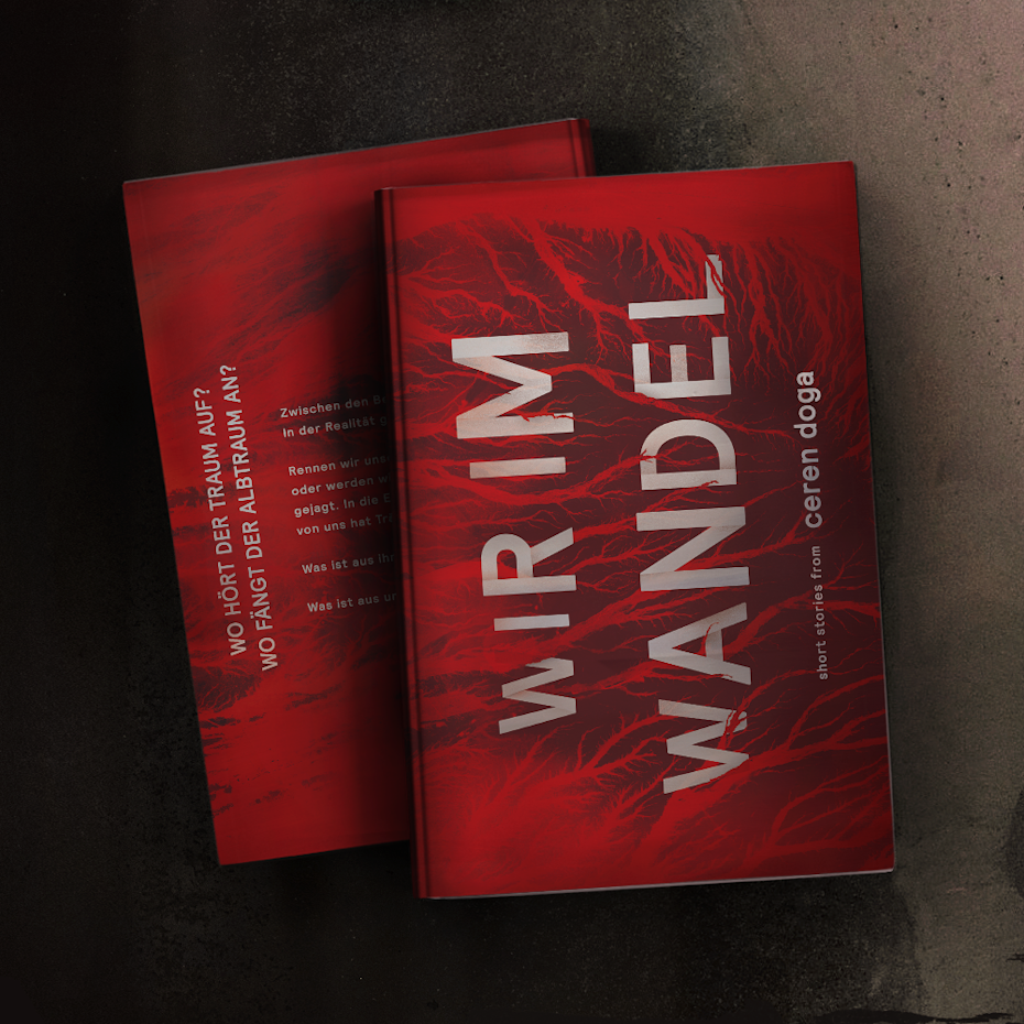
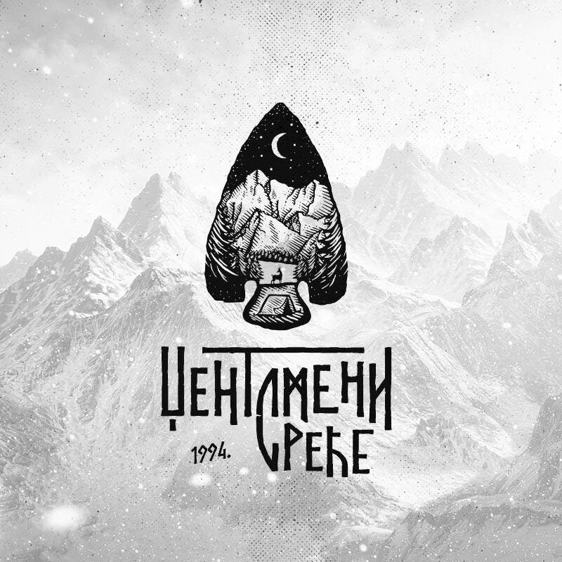
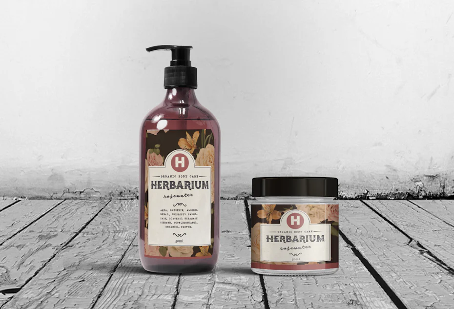
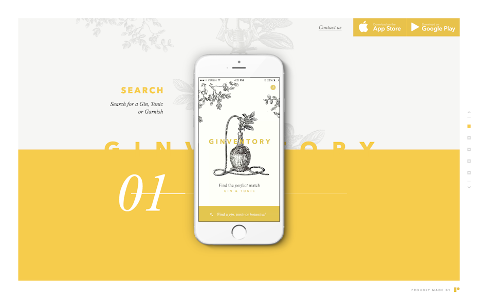
10. Highly-detailed vintage
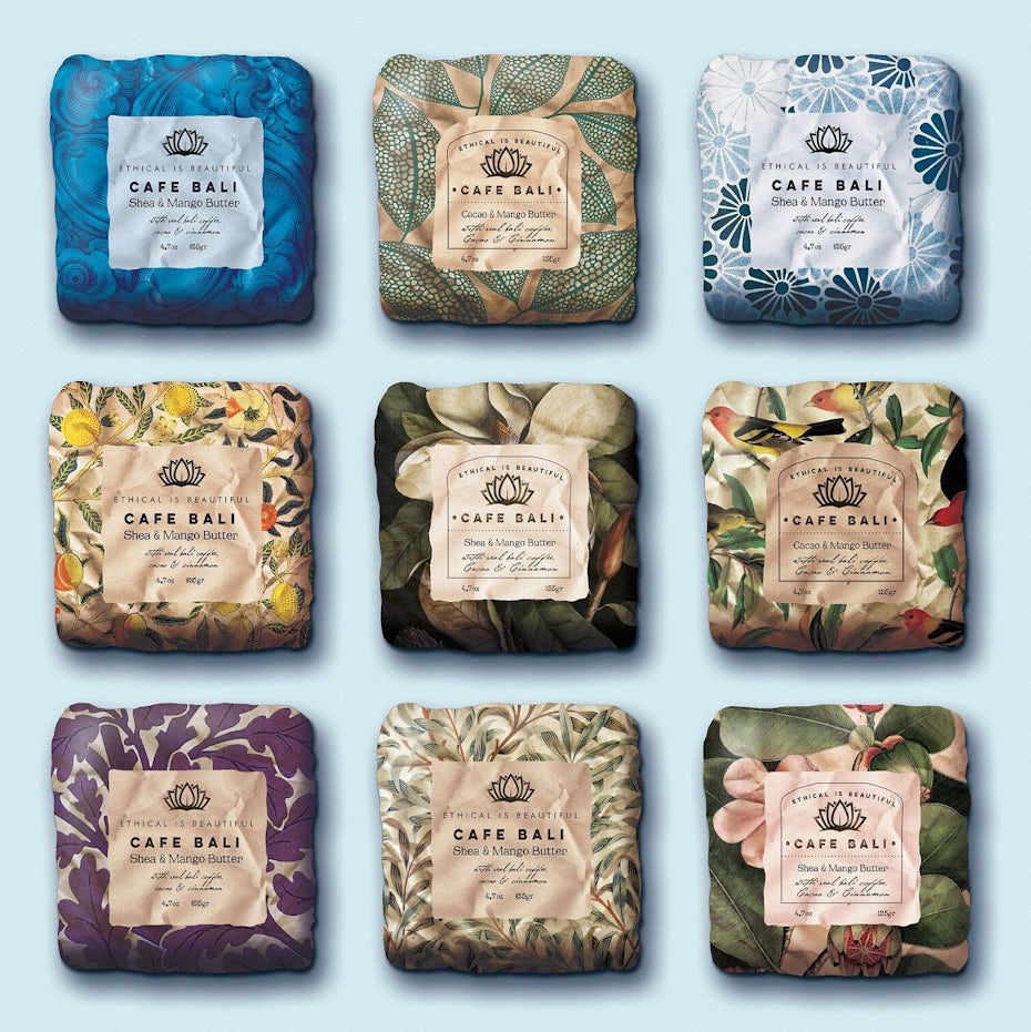
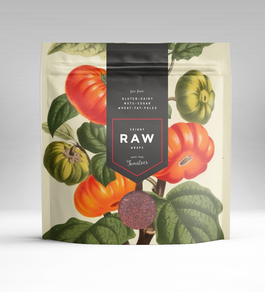
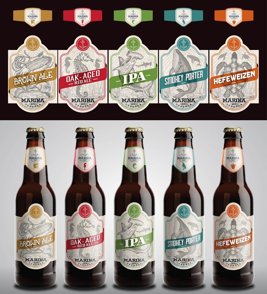
Vintage isn’t anything new (obviously), but the trend will remain strong in 2018. Though it may contradict the mainstream desire for minimalism—beautiful, finely crafted logos and illustrations are timeless. Brands looking to achieve a top-shelf look often find classic design aesthetics can provide an air of distinction and sophistication.
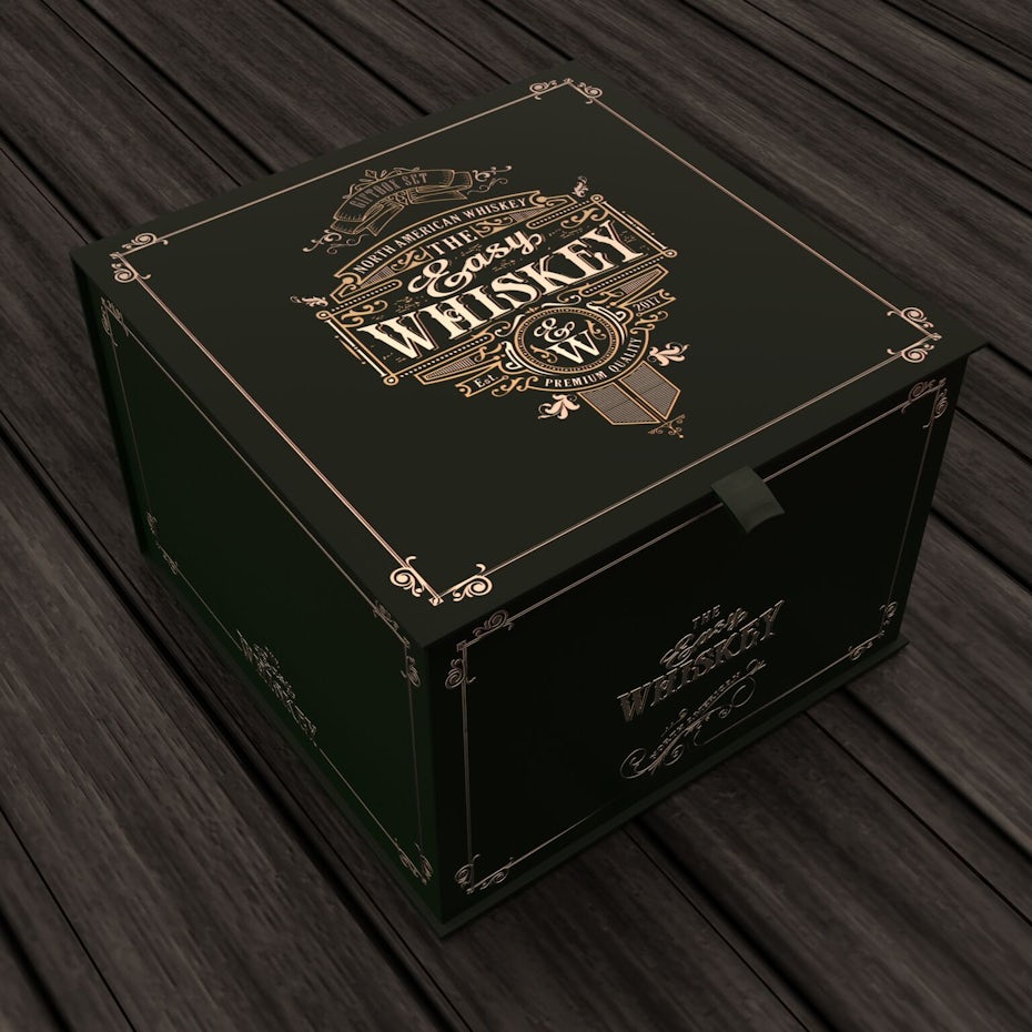
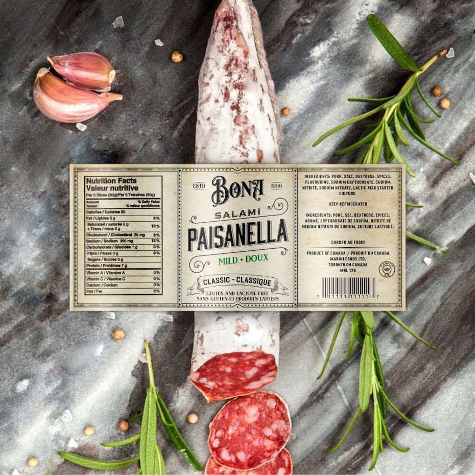
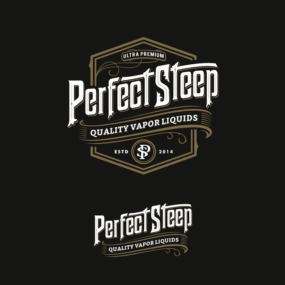
While this trend may not be practical for everyone, brands in the food and beverage industries—especially those in wine and spirits—have been leveraging this style for years with gorgeous results. Artisan, organic and natural product brands are loving this look by using it to give their products that hand-crafted, wholesome feeling of simpler times.
Are you ready for design in 2018?
—
It’s an intriguing time in graphic design. The graphic arts are being revitalized as we’re beginning to see a resistance to the flat design movement. The design scene is about to get a lot more interesting as we continue to focus more on originality and the individuality of brands and their audiences. With so many old and new styles on the table, it will be a time of taking risks and breaking patterns. Make 2018 the year you release your creativity!