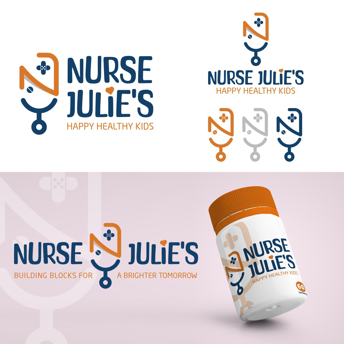

The idea was to create an isotype from the letter N and the letter J and at the same time give it a meaning, in this case we generated a kind of face that reminded us of a nurse -as indicated by the name of the product-, so we obtained a better result and better brand recognition. We also added two supporting elements such as the cross-shaped band-aids and the pill to focus it even more on the health sector.