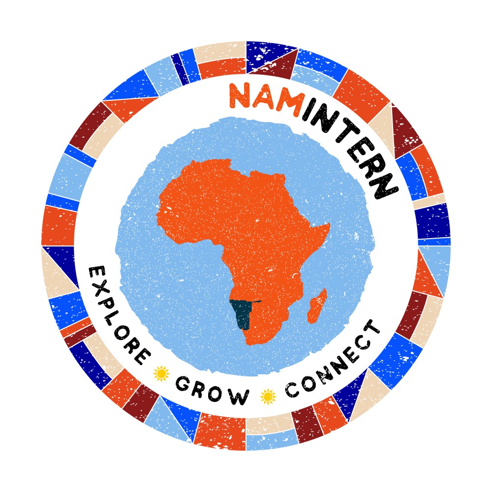

The idea behind this concept originated with a mural at the Tsumeb Art and Craft Center in Oshikoto. I loved the simplicity of the design and yet it has such fullness and vibrancy that I knew it would make a great border. I used quite a large selection of colours - usually I'd use 3 maximum in a logo design but I think it really works. Using only 3 colours in this border would have made it look very heavy.
When I looked into the colours of Namibia, the first thought was to go for the flag colours but green can be a little jarring and blue is much more crisp and contrasts so well against the orange tones of the desert.
The little stars in between the 3 key words are actually the stars that feature on the Namibian flag. I wanted to put something meaningful as an accent, not just clutter the design with meaningless icons.
Africa is full of colour and verve and I think this logo represents that.