Logo concept for a vegan and natural Cosmetic Brand

0
Created on 99designs by Vista
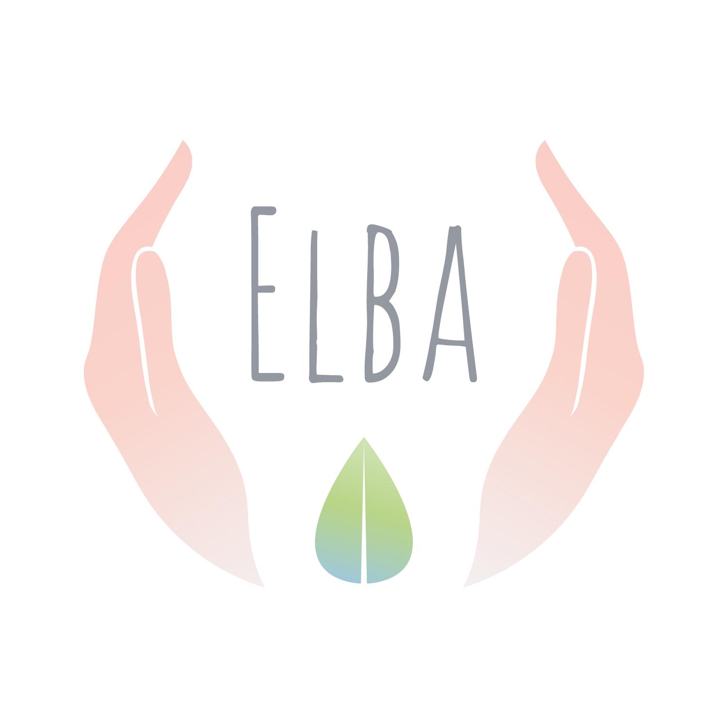
Hands refer to the idea of (beauty) care and taking care, not only of nature but also of animals (as a natural, vegan brand).
The leaf/drop wants to signify the idea of nature but also of essential oils.
The font used for Elba is young and fresh but it is also stable, so it can signify that Elba is a reliable brand.
Everything is drawn in a conceptual circle: a circle signifies balance, stability and harmony.
The colors used are natural and soft as the one selected in the Brief.
The Logo works even when negative or positive (black or white) and it is clear and visible even when it is smaller.
- The white square behind the logo is just a background used to make the logo visible on this platform but not part of the logo itself. -