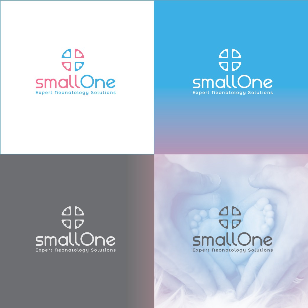

This mark was made with a suggestion of helping survive difficult moments with neonates in critical periods. Wanted to convey security in medicine/expert doctors in neonatology with the distinct medical symbol suggested in its center and also sustain with little hearts the fact they save these tiny important lives. This icon can be used in any surface at any scale. Its circular shape means union and community. Typography has been custom made for your brand, its lines are sutil but still clear and readable. Typography setup also suggests a delicate care for their little patients. Bottom slogan letters had also been slightly modified from Montserrat Alternates Google Font to connect with the main title logo name. Variant logos in black and white included. Colors used are in pastel shades of blue and pink to convey female and male babies altogether as well as to connect logo to services oriented to early parents. Blue means intellect and pink counter it with a sense of care and love.