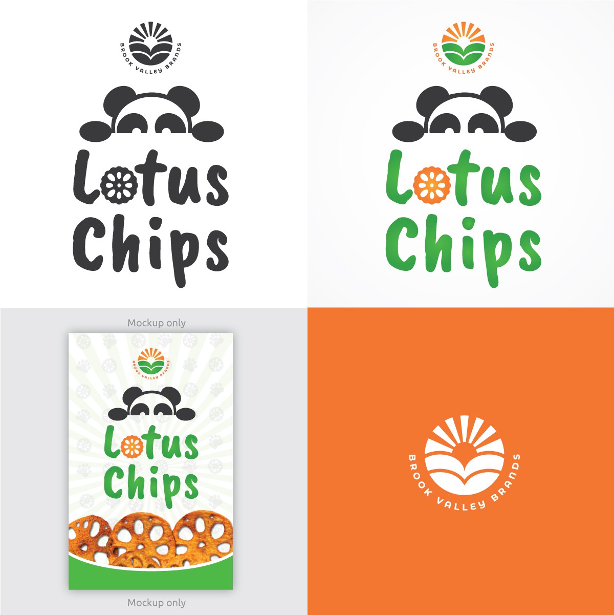
Minimal fun branding for lotus chips snacks

0
Created on 99designs by Vista
Parent company logo shows a B letter at the top and a V letter at the bottom. It shapes a heart with a sunrise at the very top. As an overall circle shape it meaning is union, community and movement. Inspires positivism, it is like a emblem/seal, to be memorable to consumers and make it their very own. Particularly the icon conveys the love for nature and healthy products, joy to distribute amazing goods, fields and valleys, nature, sunshine, joy in producing natural healthy and delicious products. Also sun rays inspire the several sub-brands/products the company have + diversity of choices. Easy to use and apply to any surface, at any size. A minimal version of the panda with a lotus chip about to eat and enjoy.