Playful Dynamic Logo for an Investment App

0
Created on 99designs by Vista
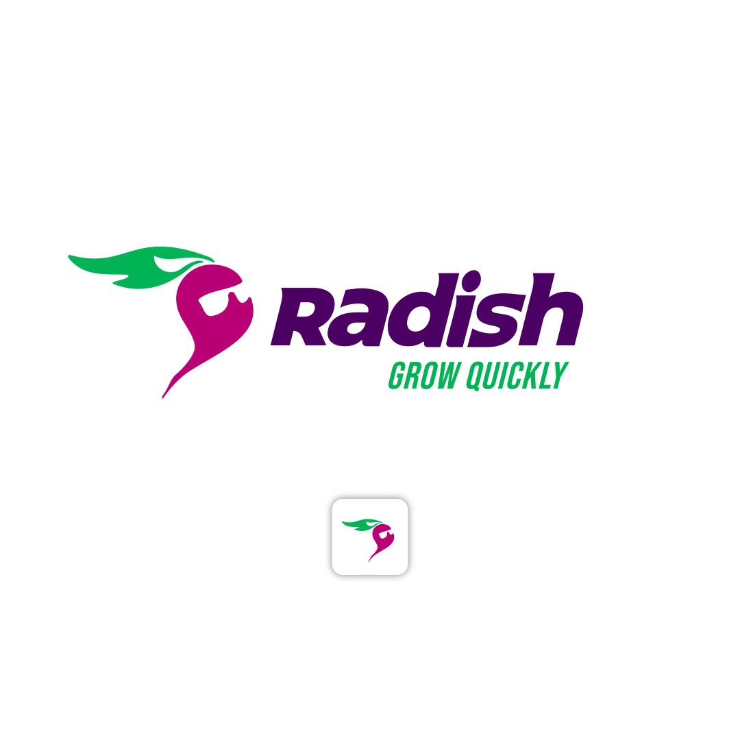
Check out the awesome Radish logo! It's not just a simple design – it's an effective app icon that's clear and recognizable, even at smaller sizes.
I have also added the sunglasses to make it feel 'rad'. On top of that, the reddish has been designed to feel like it's in fast motion towards the top which symbolizes fast growth and adds a playful, memorable touch.
The bold, slanted font for "Radish" reflects speed and growth, and the vibrant magenta and green colours evoke energy and optimism.
This logo strikes the perfect balance between professional and playful, and it's designed to be memorable, scalable, and aligned with the brand's mission of quick financial growth. It's not just a logo – it's a statement!