
One of the design options for coffee packaging. The client approved another option, but I like this one better. Because:
- It is clean
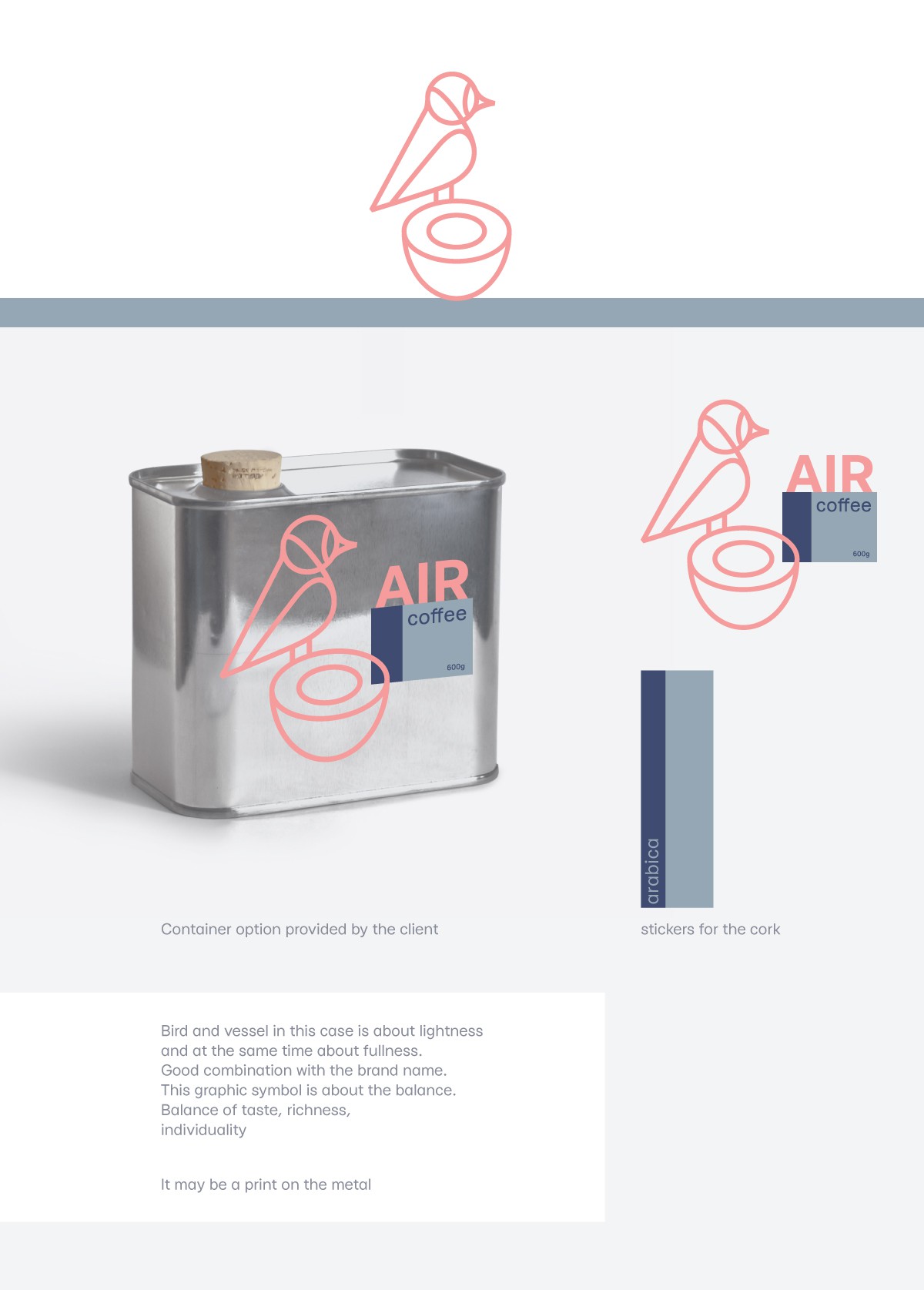
- Bird and vessel in this case is about lightness and at the same time about fullness.
- Good combination with the brand name.
- This graphic symbol is about the balance.
Balance of taste, richness,
individuality
And it can be sold